Adventure Snack
Media
Summary
Geoffrey Golden is a game writer and publisher of Adventure Snack, a "Choose Your Own Adventure”-style magazine. At first, stories were difficult to read on mobile devices and the layout felt squished. I improved the design by adding style rules for multiple screen sizes and tested them accordingly. Later on, Geoffrey used a new software specifically for making interactive stories. This allowed readers to save their progress and switch the color theme. However, there were bugs and story templates were difficult to update and maintain.
I analyzed the loading process, separated and rewrote logic, and improved the visual design and branding. Lastly, I gave writers the ability to apply additional styling to content elements. The new platform was open-sourced as Winky, and new Adventure Snack stories were not only easier to customize, but they also won awards in interactive fiction contests.
Media
Project Links
Features
- Improved design for multiple screen sizes
- Better color contrast to reduce eye strain
- Writers can add styles to images and choices
- Simple to adjust fonts, colors, animations, and more
- Modular code for easier upgrades and maintenance
Design / Tech
App:
- Inky
Code:
- HTML,
- CSS,
- JavaScript,
- PHP
Testing:
- Sizzy
Process
Adventure Snack uses Substack for email updates and introductory story pages. Initially, a story's subsequent pages were published with WordPress. I modified a header template to display content at its original size and added design rules for different screen sizes. Then during testing, adjustments were made using an emulator for mobile, tablet, and large screens.
A few years later, after Geoffrey began writing and exporting stories using the Inky editor software. I was asked to duplicate the previous web design, investigate a few display-related bugs, and add a few features.
I cleaned up the codebase, removed performance bottlenecks, and made a new build process with code splitting. Adventure Snack fonts were used and the styling instructions were first normalized, and then loaded using a settings file (CSS variables) for easy future customization.
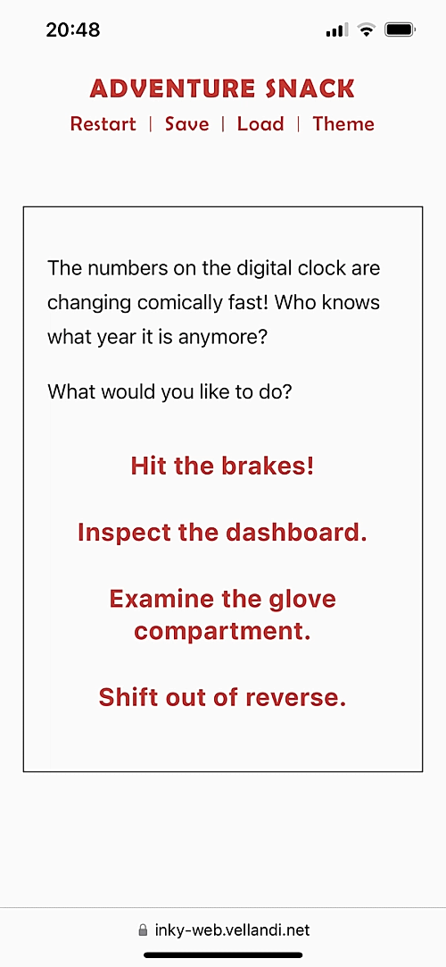
The ability to style images and story choices was added along with a zoom-in header animation and multi-screen web design. Geoffrey was advised on changes and could test drive the new web template using a story hosted via GitHub pages. Documentation was provided and the template was open-sourced.
Summary
Geoffrey Golden is a game writer and publisher of Adventure Snack, a "Choose Your Own Adventure”-style magazine. At first, stories were difficult to read on mobile devices and the layout felt squished. I improved the design by adding style rules for multiple screen sizes and tested them accordingly. Later on, Geoffrey used a new software specifically for making interactive stories. This allowed readers to save their progress and switch the color theme. However, there were bugs and story templates were difficult to update and maintain.
I analyzed the loading process, separated and rewrote logic, and improved the visual design and branding. Lastly, I gave writers the ability to apply additional styling to content elements. The new platform was open-sourced as Winky, and new Adventure Snack stories were not only easier to customize, but they also won awards in interactive fiction contests.
Project Links
Process
Adventure Snack uses Substack for email updates and introductory story pages. Initially, a story's subsequent pages were published with WordPress. I modified a header template to display content at its original size and added design rules for different screen sizes. Then during testing, adjustments were made using an emulator for mobile, tablet, and large screens.
A few years later, after Geoffrey began writing and exporting stories using the Inky editor software. I was asked to duplicate the previous web design, investigate a few display-related bugs, and add a few features.
I cleaned up the codebase, removed performance bottlenecks, and made a new build process with code splitting. Adventure Snack fonts were used and the styling instructions were first normalized, and then loaded using a settings file (CSS variables) for easy future customization.
The ability to style images and story choices was added along with a zoom-in header animation and multi-screen web design. Geoffrey was advised on changes and could test drive the new web template using a story hosted via GitHub pages. Documentation was provided and the template was open-sourced.
Media
Features
- Improved design for multiple screen sizes
- Better color contrast to reduce eye strain
- Writers can add styles to images and choices
- Simple to adjust fonts, colors, animations, and more
- Modular code for easier upgrades and maintenance
Design / Tech
App:
- Inky
Code:
- HTML,
- CSS,
- JavaScript,
- PHP
Testing:
- Sizzy